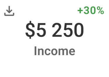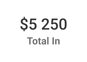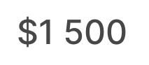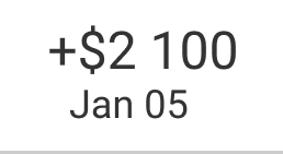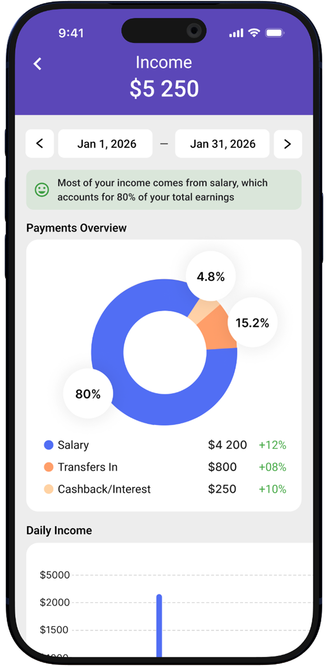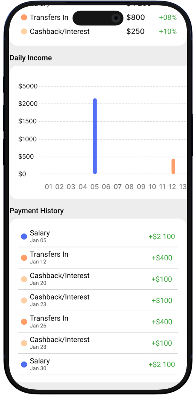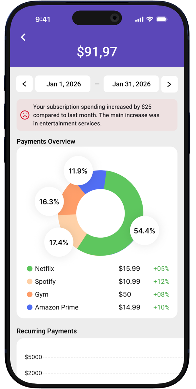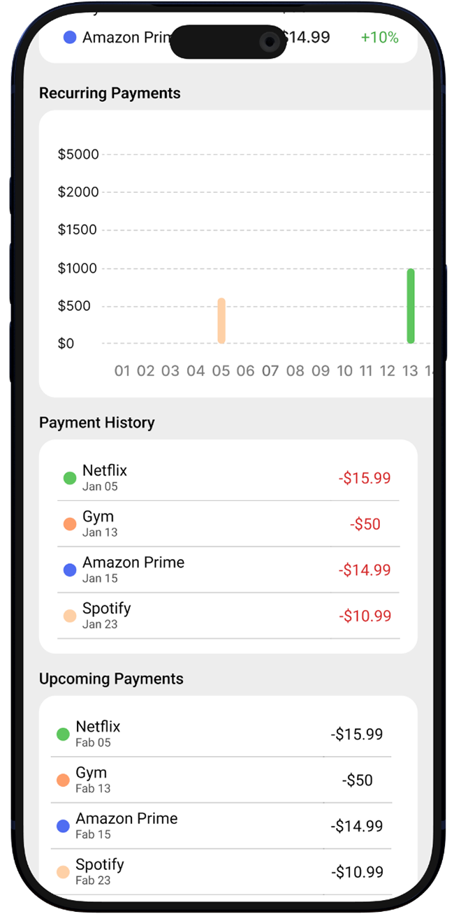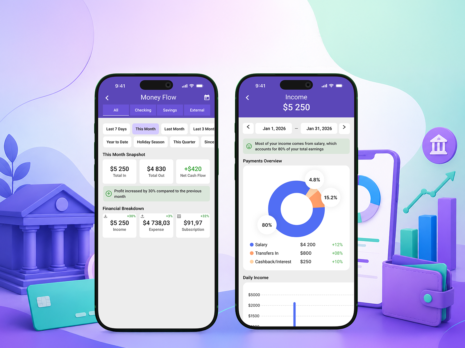
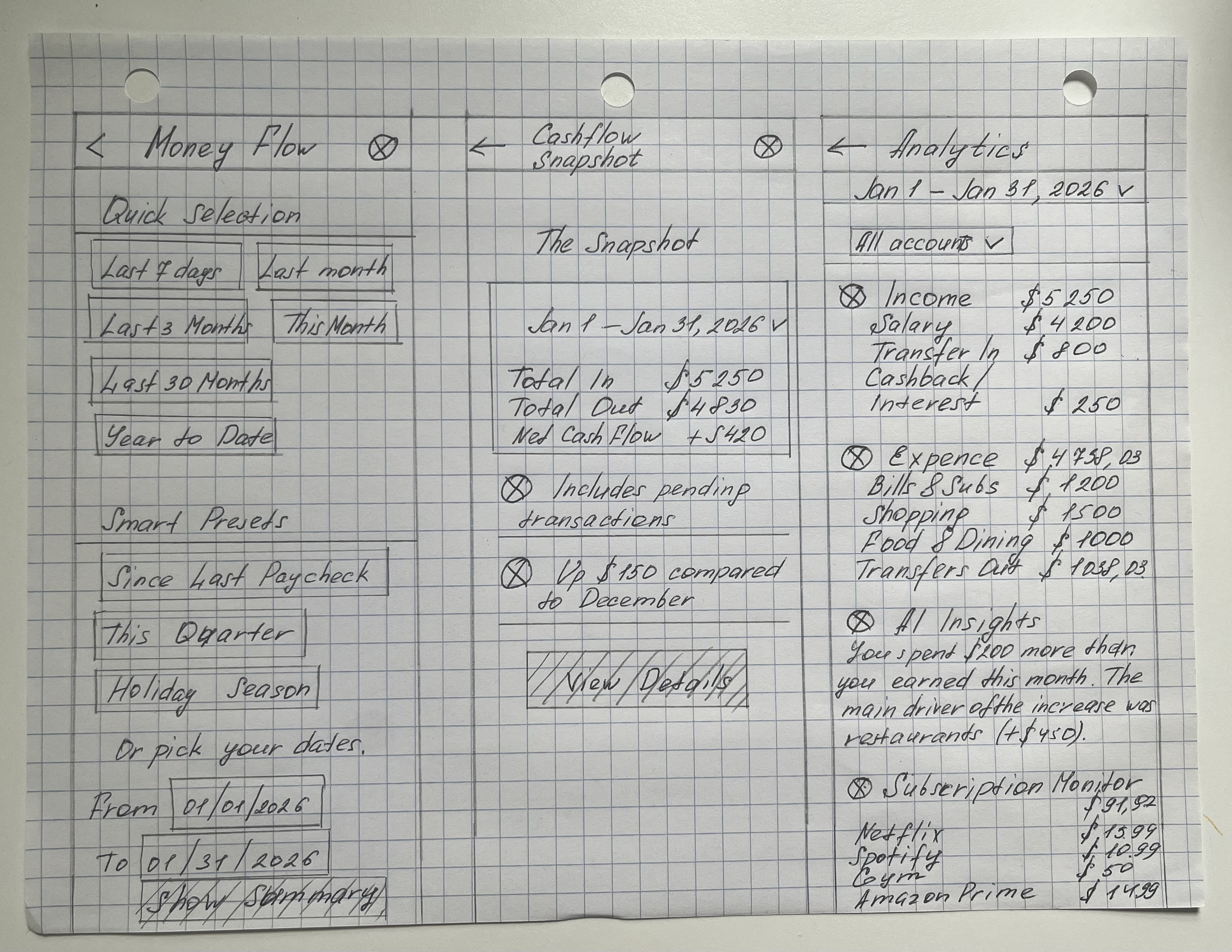
Design a feature that shows users how much money came in and how much went out over a selected period — no manual calculations, no unnecessary screens.
I conducted a survey among users of banking apps — through in-person conversations and online correspondence — and also analyzed their feedback and subjective opinions to identify pain points in the user experience.
Design a feature that shows users how much money came in and how much went out over a selected period — no manual calculations, no unnecessary screens.
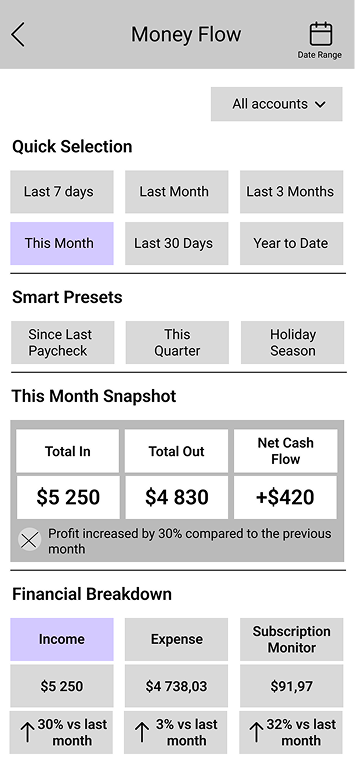
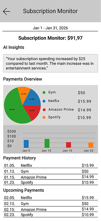
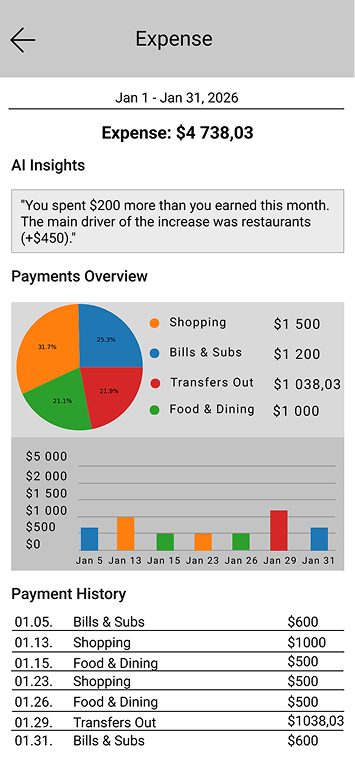
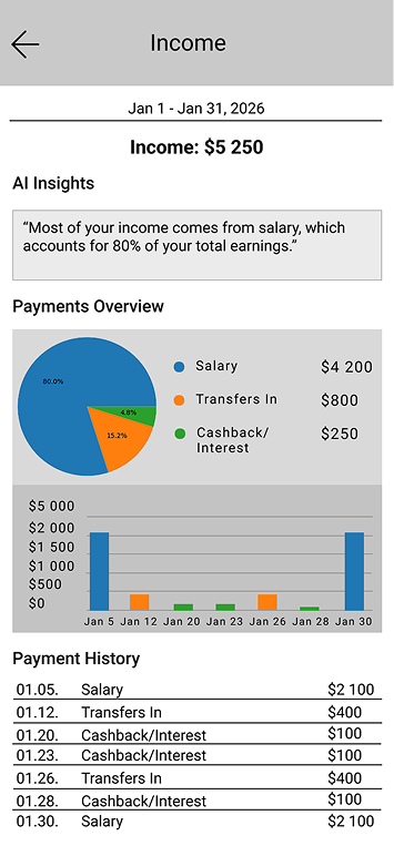

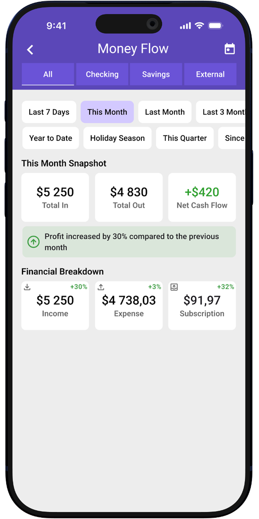
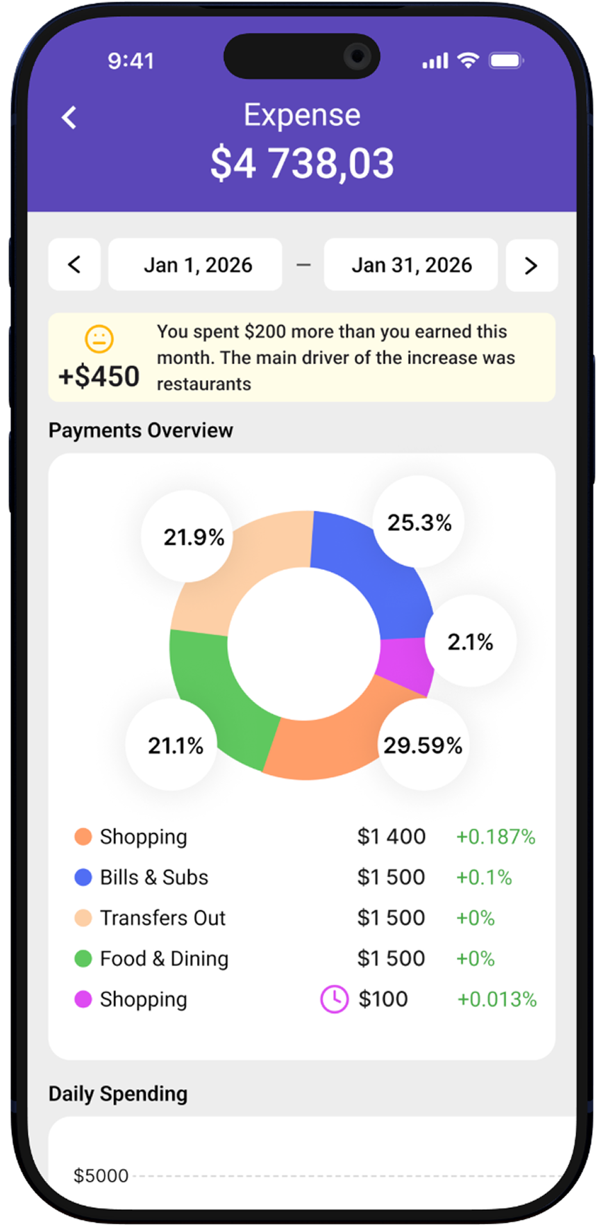
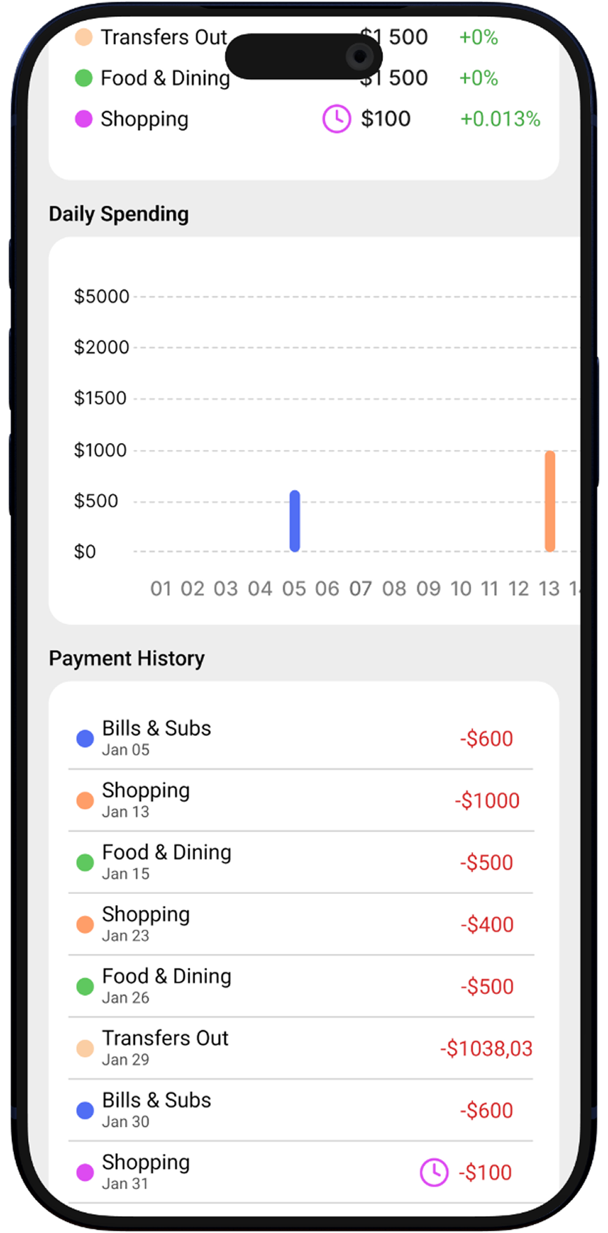
I developed a custom design system with tokens for colors, spacing, and corner radii, along with a library of reusable components. A unified token system ensured visual consistency across all screens, simplified updates, and sped up the workflow — any change to a token applies automatically everywhere.